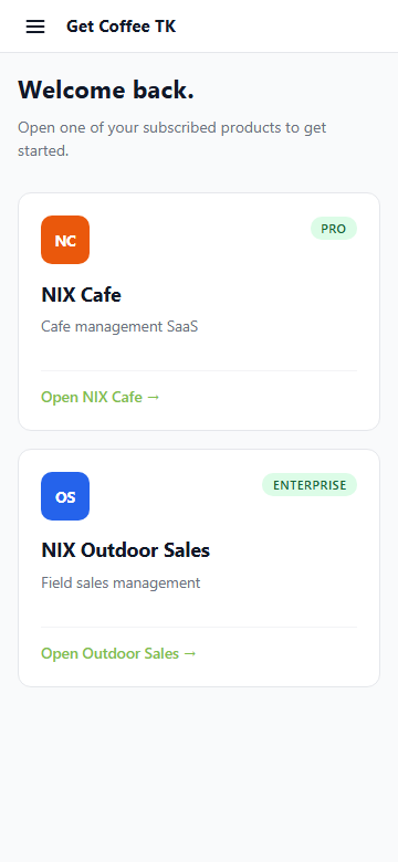
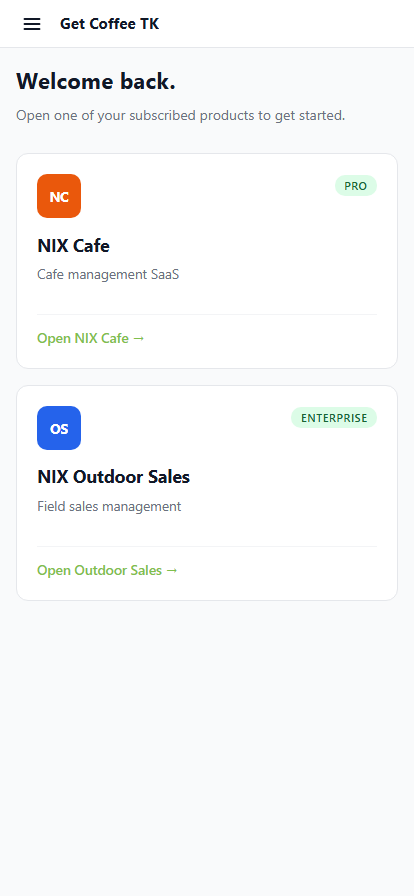
Launchpad
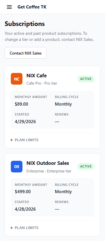
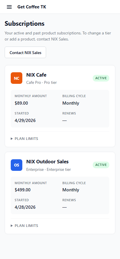
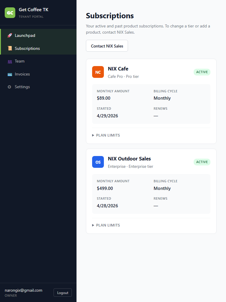
Subscriptions
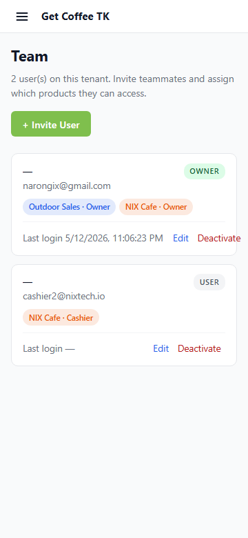
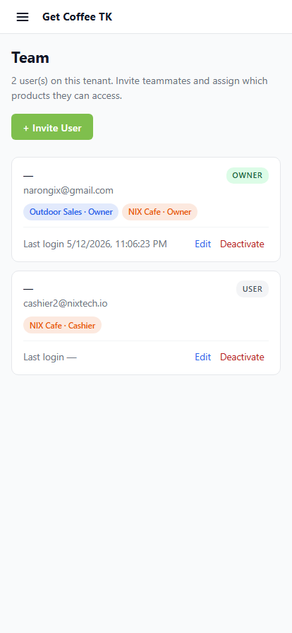
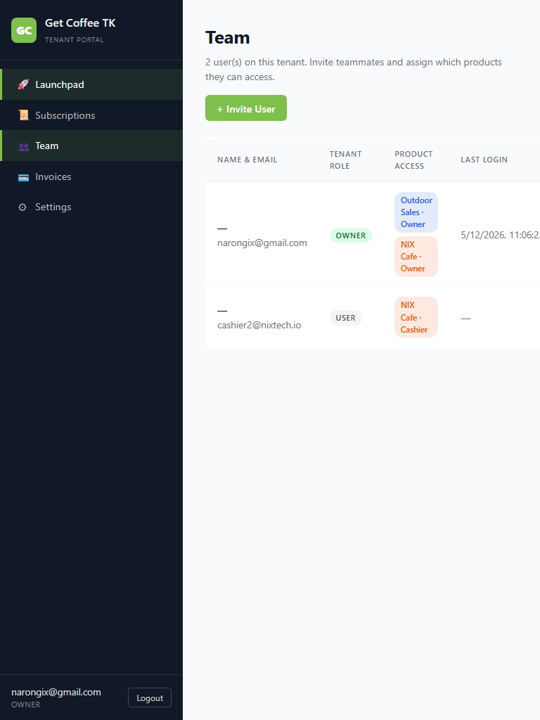
Team (table → cards on phone)
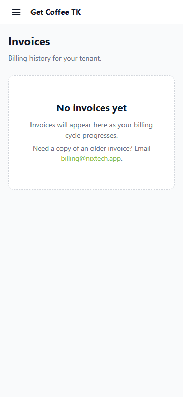
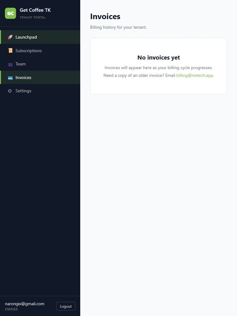
Invoices (table → cards on phone)
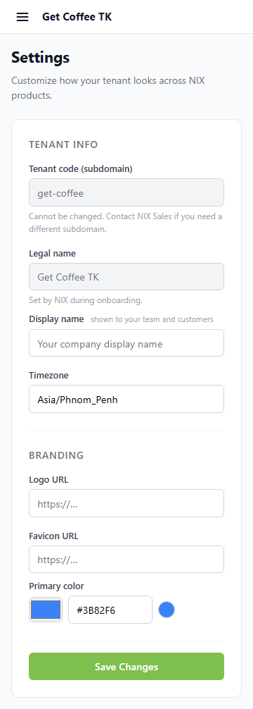
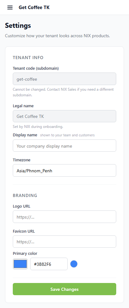
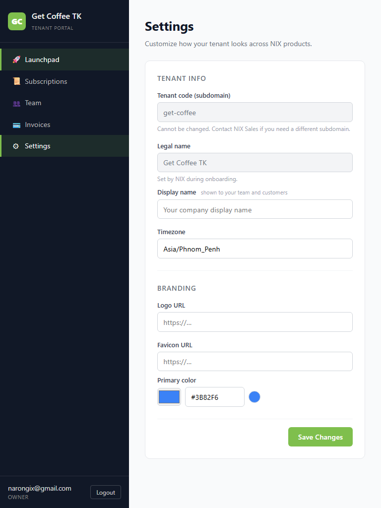
Settings
Sidebar drawer open (360 phone)
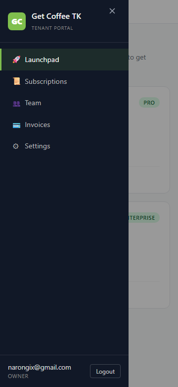
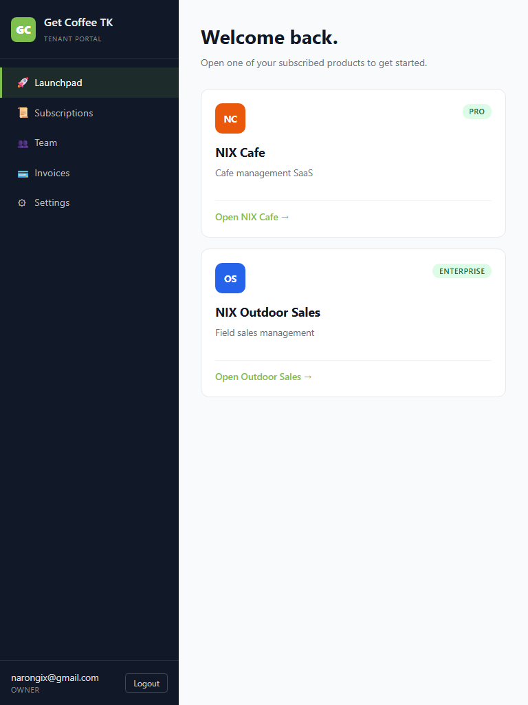
Narong's feedback continued — after Cafe, the same treatment for Commerce, which is the SSO host every user hits before reaching a product. Same problem: 260px sidebar always visible, table-heavy pages (Team, Invoices) with no overflow handling. 5 user-facing surfaces made mobile-responsive: Launchpad, Subscriptions, Team, Invoices, Settings. Login + Onboard were already centered-card layouts and didn't need changes.
karouna-dev: 4943208 (pre-existing fix for cross-product login redirect: window.location.href instead of router.push when redirecting to /cafe//outdoor) + 50a8998 (the mobile work itself, +368/-45 across 6 files).
| Suite | Result | Notes |
|---|---|---|
| test-commerce-mobile-responsive-prod.mjs | 18/18 | This batch — 5 pages × 3 viewports + drawer-open + no-5xx |
| test-mobile-responsive-prod.mjs (Cafe) | 33/33 | Prior mobile batch re-verified — Cafe screenshots still correct after Commerce changes |
| test-phase1-prod.mjs | 11/11 | SSO + Cafe routes |
| test-phase2-sso-outdoor-prod.mjs | 6/6 | Outdoor SSO bridge (Commerce hosts the login) |
| test-r7-prod.mjs | 14/14 | Dashboard + manager-live drawer |
| test-r8-prod.mjs | 4/4 | Auth/security |
| test-m1-prod.mjs | 10/10 | Shop scoping |
nix-commerce / 6 files changed +368/-45 (single commit 50a8998), plus
prior LoginView fix 4943208 +14/-1 for cross-product redirect (unrelated
but bundled in this Gate 2 push because it was in working tree).

  src/layouts/CommerceLayout.vue
    + Mobile sticky top strip with hamburger + tenant name (display:none above 768px)
    + Drawer backdrop (display:none above 768px; click-to-close)
    Sidebar:
      mobile (<768px): position:fixed, transform:translateX(-100%), .drawer-open
                       overrides to translateX(0), 0.2s ease-out slide
      desktop (>=768px): unchanged (static 260px column)
    + Drawer close X button (top-right of sidebar, mobile-only)
    + Vue watch on route.fullPath → drawerOpen=false (auto-close on navigation)
    + Vue watch on drawerOpen → document.body.style.overflow lock
    + onUnmounted cleanup to restore body scroll

  src/views/TeamView.vue
    Added .user-cards block alongside the .user-table (display:none by default)
    @media (max-width: 767px):
      .user-table { display:none } / .user-cards { display:flex }
      Modal: padding 1.75rem → 1.25rem, max-width:none, actions stack column-reverse
             with width:100%

  src/views/InvoicesView.vue
    Added .invoice-cards block, similar table/cards swap pattern
    @media (max-width: 767px): table hides, cards show; page max-width clears

  src/views/LaunchpadView.vue
    @media (max-width: 767px):
      .card-grid { grid-template-columns: 1fr }
      .page-head h1 { font-size: 1.4rem }

  src/views/SubscriptionsView.vue
    @media (max-width: 767px):
      .sub-grid { grid-template-columns: repeat(2, 1fr); padding 0.85rem }
      .sub-head { flex-wrap: wrap }
      .page-head h1 { font-size: 1.35rem }

  src/views/SettingsView.vue
    @media (max-width: 767px):
      .row { grid-template-columns: 1fr }
      .actions .btn-primary { width: 100% }
      .page-head h1 { font-size: 1.35rem }
None blocking.

- LoginView + OnboardView already mobile-friendly (centered max-w-400/440px
  cards with 2rem outer padding). Confirmed via screenshots.
- ImpersonationBanner stretches across the top — fine on any width since
  it's text + a single button.
- ToastContainer is fixed-position bottom-right; should auto-adapt.
- Considered making the drawer width responsive (narrower on 360px to
  give more peek of the content underneath) — current 260px feels right
  per screenshot.