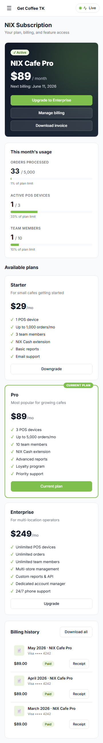
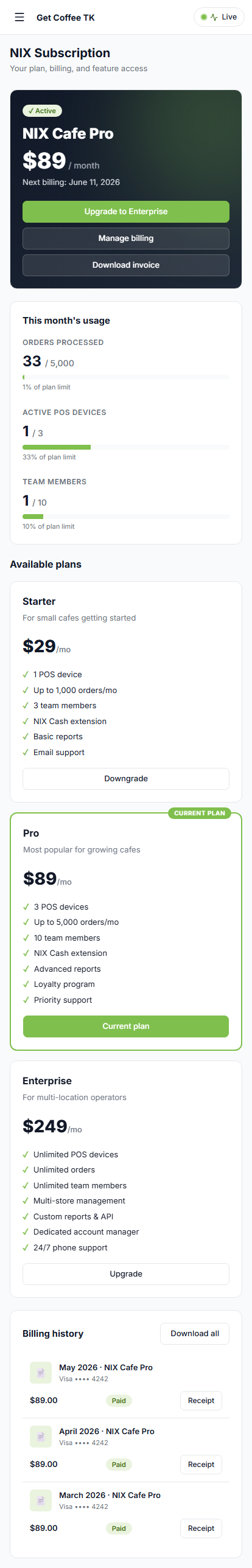
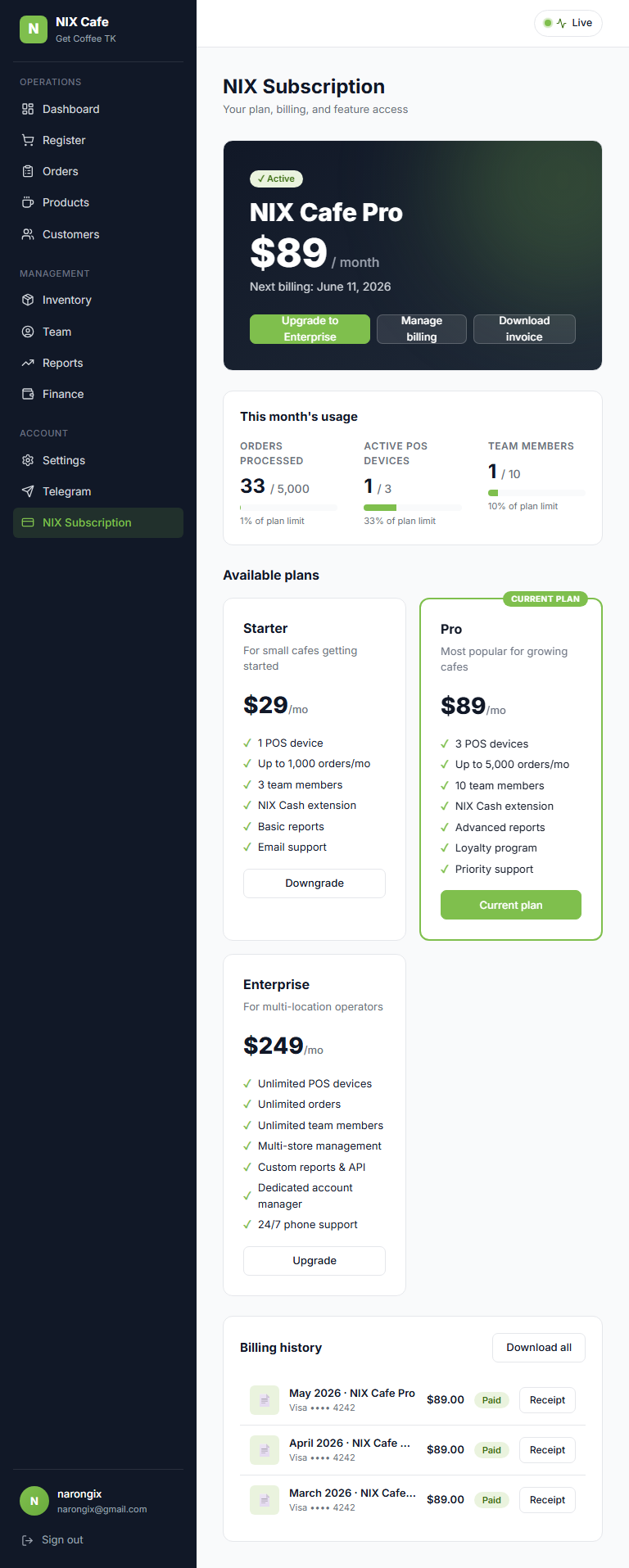
Subscription
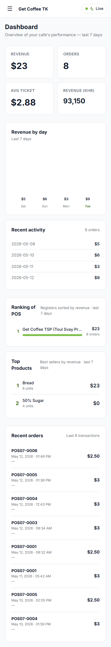
Dashboard
Orders


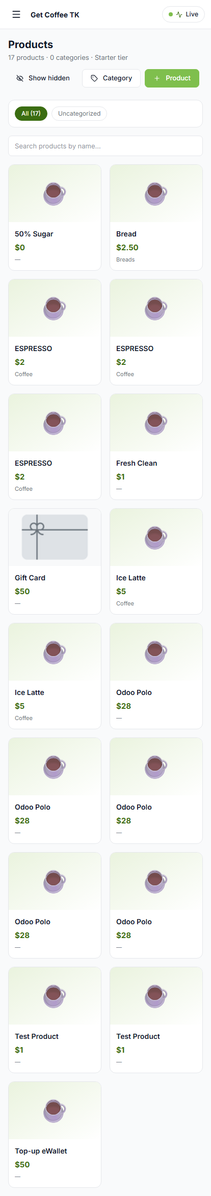
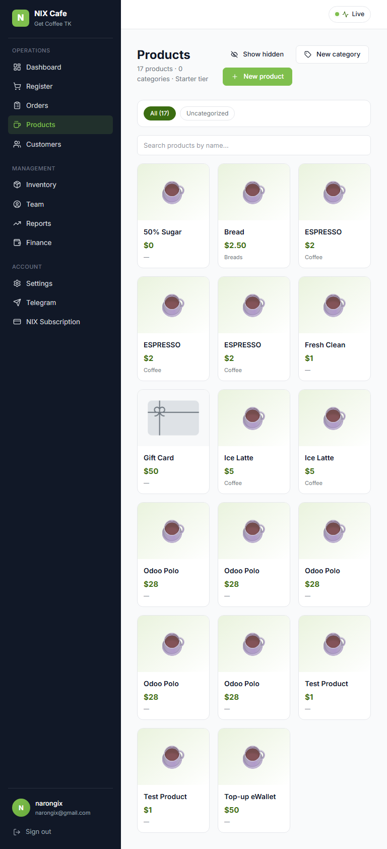
Products
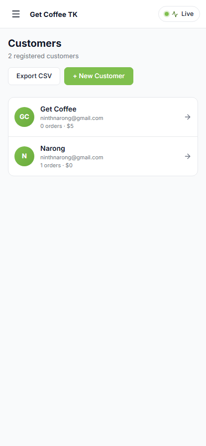
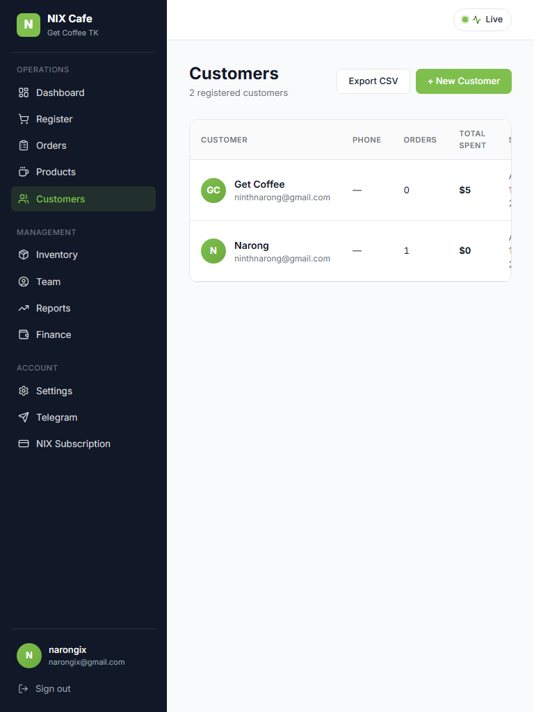
Customers

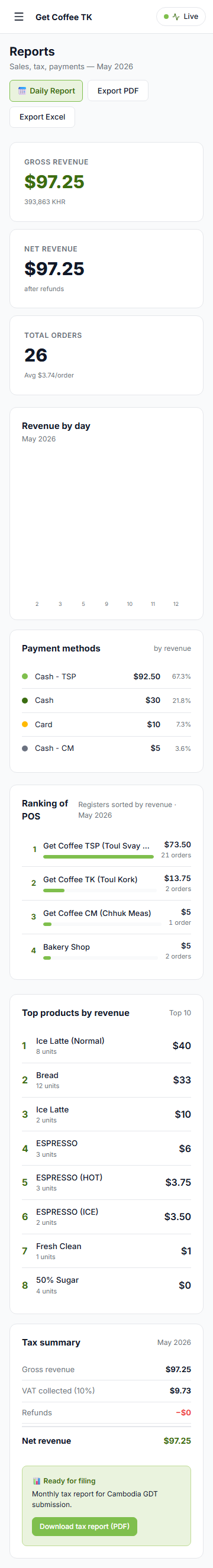
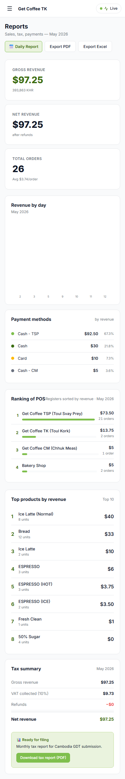
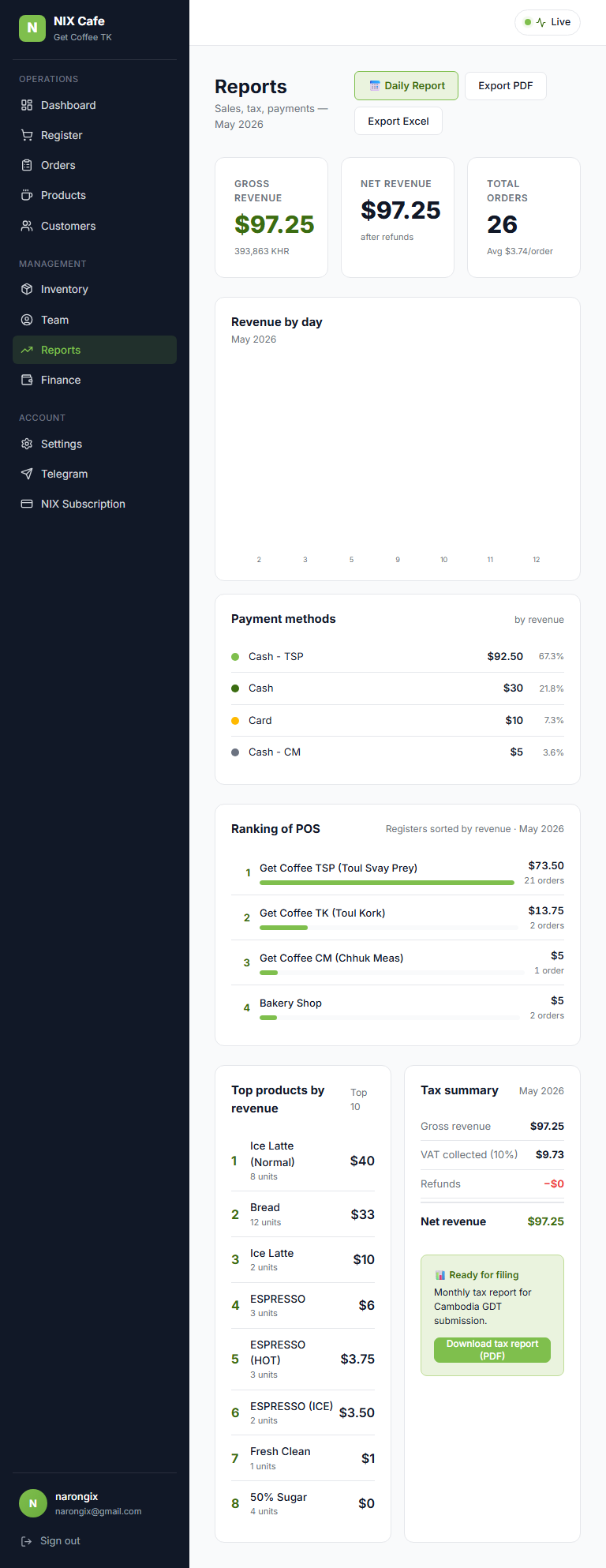
Reports (monthly)
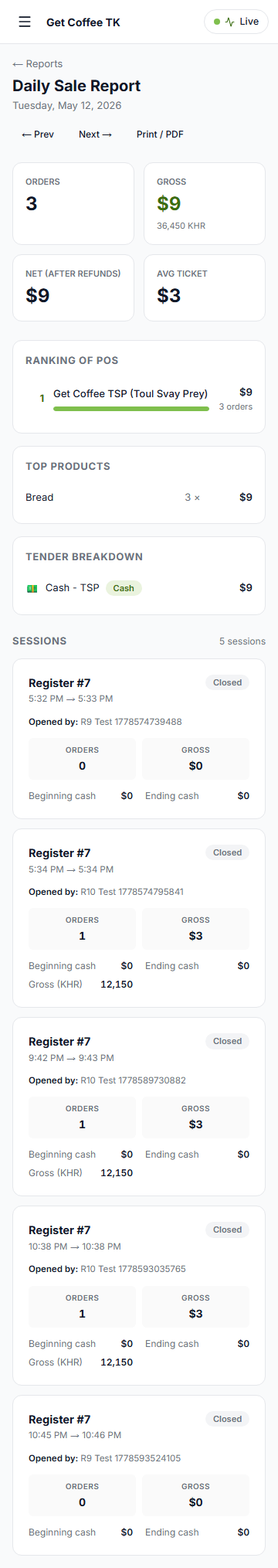
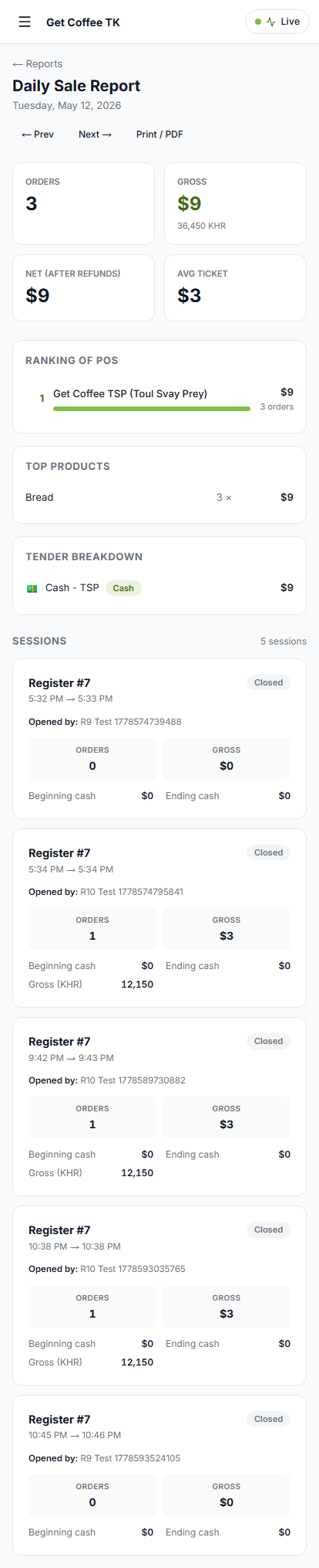
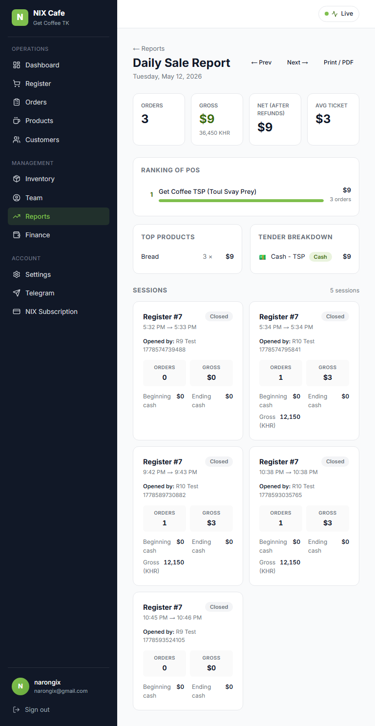
Reports / Daily
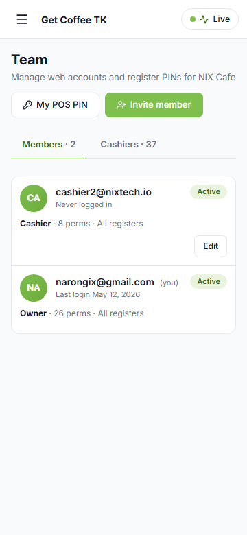
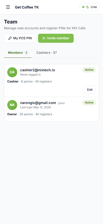
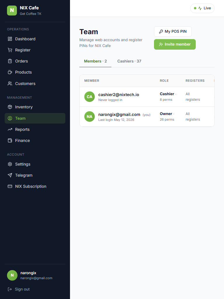
Team
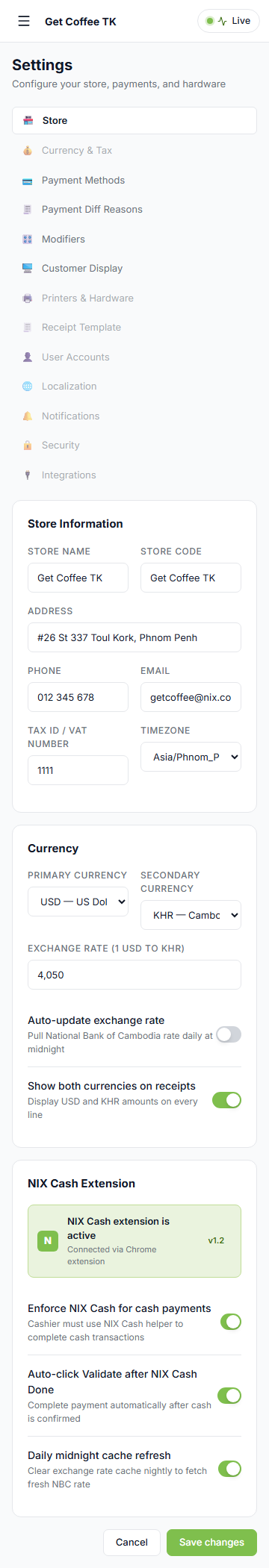
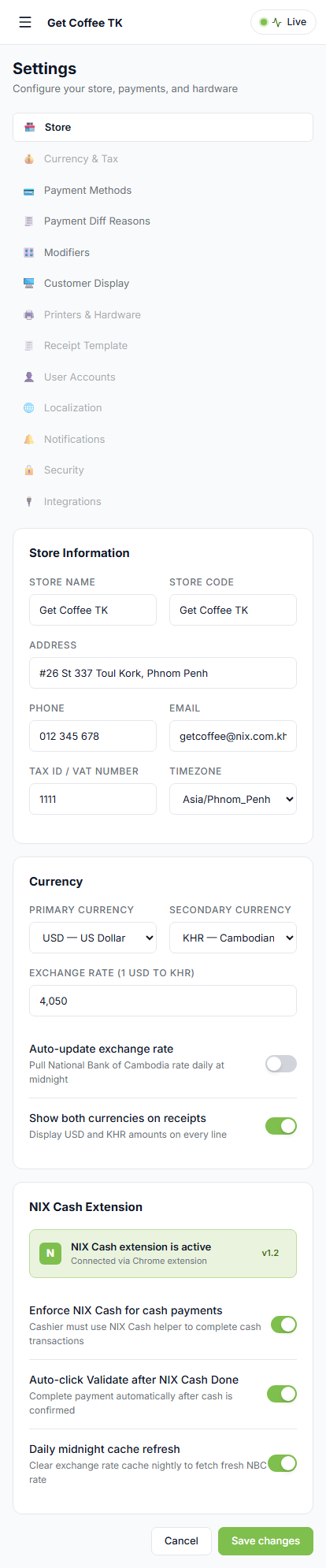
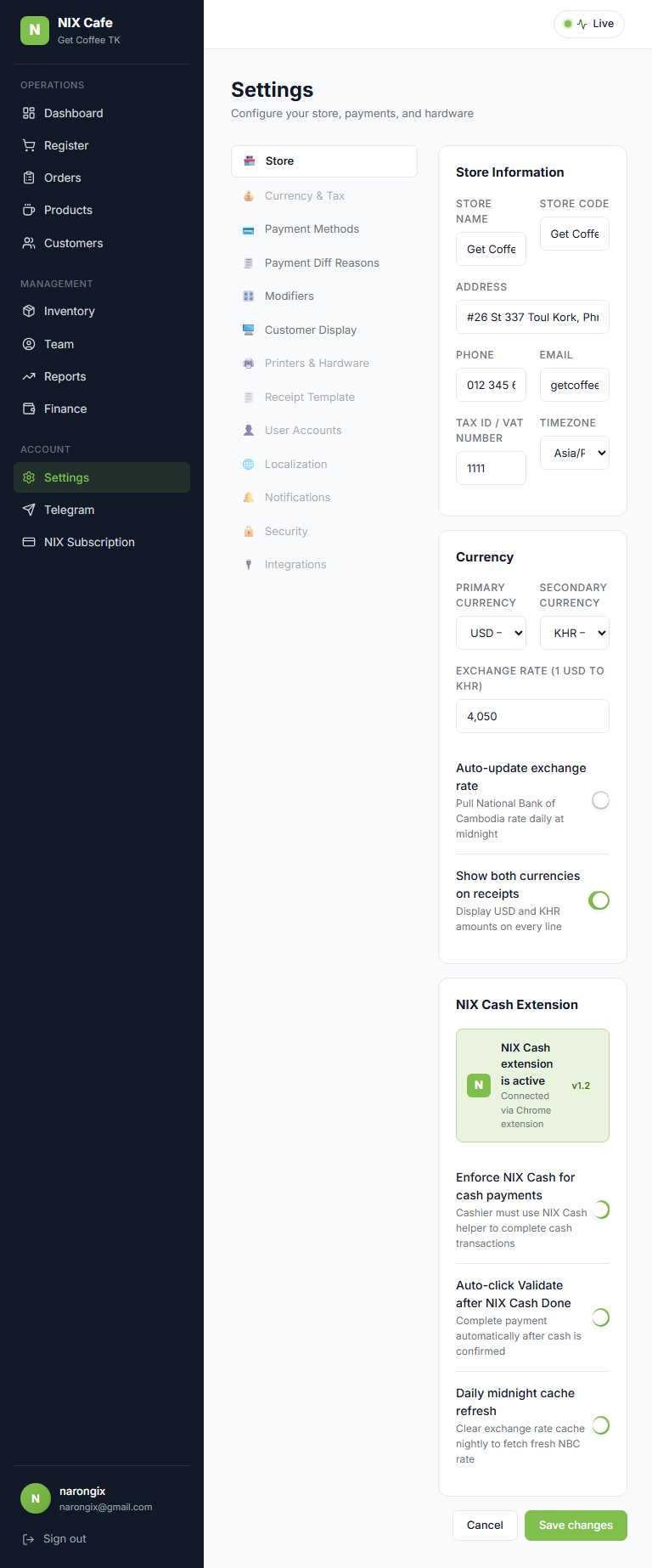
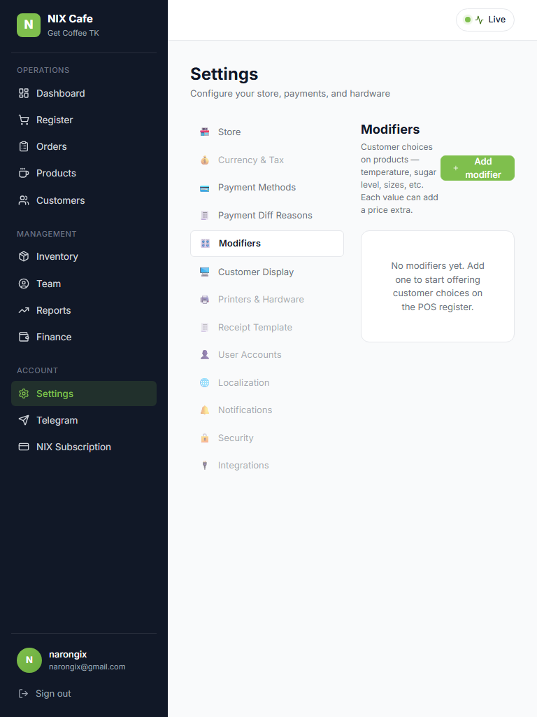
Settings (Store / index)
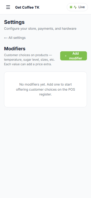
Settings / Modifiers (sub-route — back-link UX on phone)
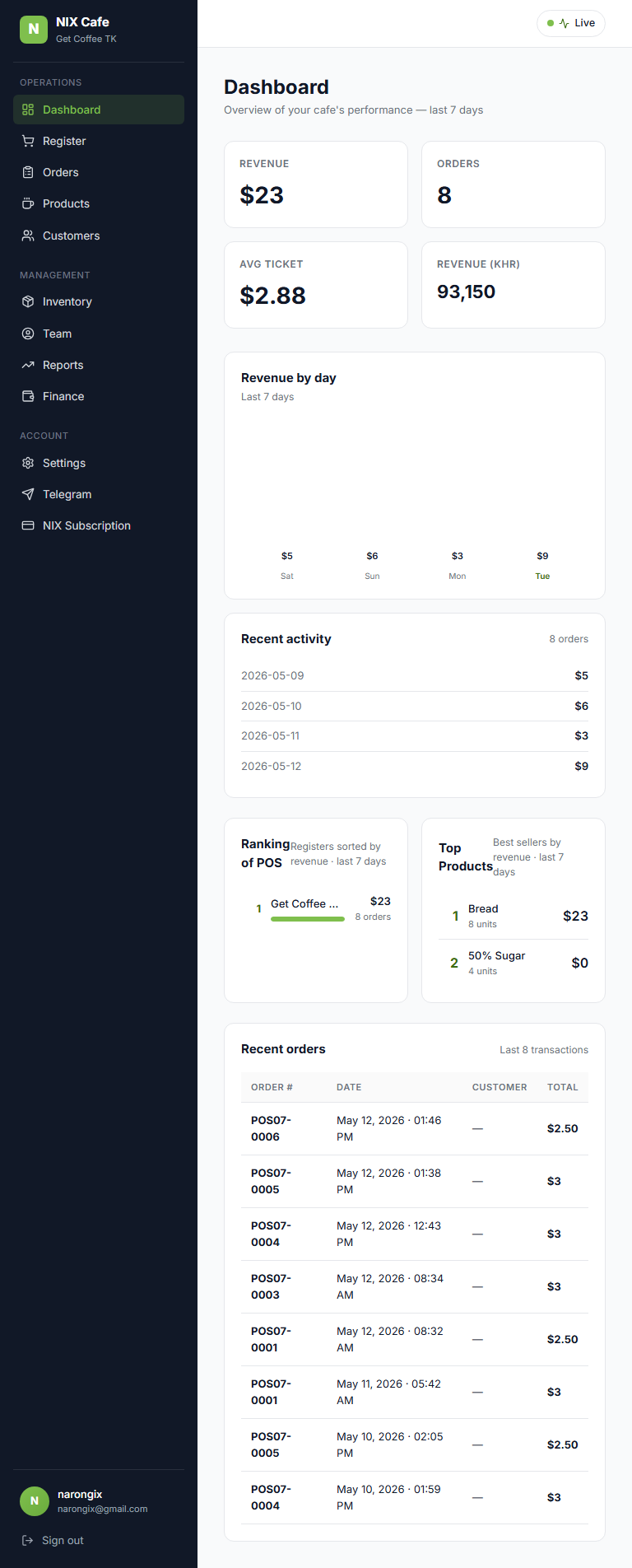
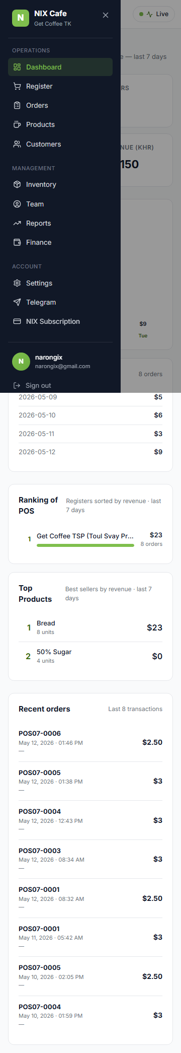
Sidebar drawer (360 phone)
Narong's feedback: "NIX Cafe is not mobile responsive at all." Confirmed — sidebar was a fixed 240px-wide always-visible aside, page grids used fixed grid-cols-3/grid-cols-5 patterns, tables had no overflow handling. On a phone the sidebar consumed 64% of the viewport and the remaining content overflowed off-screen. This batch makes the entire admin surface usable from phone (360-414px) and tablet (768px) portrait. POS register paths intentionally left desktop/tablet-only per scoping — cashiers use physical registers, not phones.
karouna-dev: 50c6f2b (main, +561/-165 across 12 files) + ca029d5 (regression fix — collapsed mobile + desktop top strips into one so ManagerLiveControl renders exactly once; first push had r7 7/14 because testids resolved to 2 elements).
md (hamburger trigger + backdrop + body-scroll lock, auto-closes on route change). Desktop unchanged.md: original tables. Below: stacked cards with key fields + actions preserved.grid-cols-2 lg:grid-cols-4. Subscription gauges + plans 1 / sm:2 / lg:3. Reports KPIs 1 / sm:3. Products grid keeps existing 2 / md:3 / lg:4 / xl:5.md. On /settings index the full nav renders above the Store form. On any sub-route the nav collapses to a single "← All settings" back link.p-4 md:p-8 lg:p-10 — phone gets 16px gutters, desktop keeps 32-40px.| Suite | Result | Notes |
|---|---|---|
| test-mobile-responsive-prod.mjs | 33/33 | This batch — 10 pages × 3 viewports + drawer-open + no-5xx |
| test-phase1-prod.mjs | 11/11 | SSO + Cafe routes |
| test-phase2-sso-outdoor-prod.mjs | 6/6 | Outdoor SSO bridge |
| test-phase2-cafe-multishop-prod.mjs | 6/6 | Multi-shop (demo creds) |
| test-m1-prod.mjs | 10/10 | Shop scoping |
| test-r7-prod.mjs | 14/14 | Dashboard + manager-live drawer (was 7/14 before strip-dedup fix) |
| test-r8-prod.mjs | 4/4 | Auth/security |
| test-r9-prod.mjs | 16/16 | Open Orders + per-line refund |
| test-r10-prod.mjs | 16/16 | Product variants |
First push (50c6f2b) used two parallel top strips:

  <div className="md:hidden ...">
    <MobileNavTrigger /> <TenantName /> ...
    {showManagerLive && <ManagerLiveControl />}    ← copy 1
  </div>
  <div className="hidden md:flex ...">
    {showManagerLive && <ManagerLiveControl />}    ← copy 2
  </div>

CSS hides one or the other at each breakpoint, but BOTH render in the DOM
so Playwright's getByTestId('manager-live-trigger') resolved to 2 elements
→ strict-mode violation → 7/14 r7 fails. Also a real UX bug: two
independent drawer instances mounted simultaneously, even if only one is
visible — clicking either could open inconsistent state.

Fix (ca029d5): single strip with all controls rendered exactly once.
Mobile bits (hamburger + tenant name) self-hide via md:hidden on the
individual elements; right-aligned controls (ShopSelector +
ManagerLiveControl) naturally end up right-aligned via a flex-1 spacer.
The whole strip hides on desktop only when nothing on the right is shown
(so we don't render an empty white bar for users without dashboard
permission).

Reusable lesson: components that own their own state should render
ONCE per page. CSS-hiding two copies of the same component is a bug
even if only one is visible at a time.
nix-cafe / 13 files changed (combined across 2 commits, +573/-187, 1 net regression fix)
components/layout/sidebar.tsx
+ MobileNavProvider context — owns open/close state, locks body scroll
while open, auto-closes on pathname change
+ MobileNavTrigger button (md:hidden, hamburger)
Sidebar drawer:
mobile: fixed inset-y-0 left-0 z-50, transform translate-x driven by
context state, slide transition
desktop: md:static, md:translate-x-0 — flex item, always visible
Close X button + click-on-backdrop both close
app/(authed)/layout.tsx
Wrap with MobileNavProvider
SINGLE top strip — hamburger + tenant name (md:hidden internal) + spacer
+ ShopSelector + ManagerLiveControl (rendered once, naturally
right-aligned via flex-1 spacer); strip hides on desktop when no
right-side controls
Body padding p-4 md:p-8 lg:p-10
app/(authed)/subscription/page.tsx
Hero buttons stack on phone; usage gauges grid-cols-1 sm:grid-cols-3;
plan cards grid-cols-1 sm:grid-cols-2 lg:grid-cols-3; billing rows
flex-col sm:flex-row with vertical icon+title/horizontal amount+chip+button
on phone
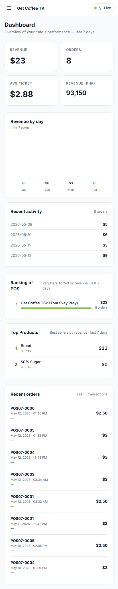
app/(authed)/dashboard/page.tsx
KPIs grid-cols-2 lg:grid-cols-4; chart+activity stack on phone via
lg:grid-cols-3 (col-span-2 → lg:col-span-2)
Recent-orders TABLE on md+, divide-y cards (order# + date + customer
+ total) on phone
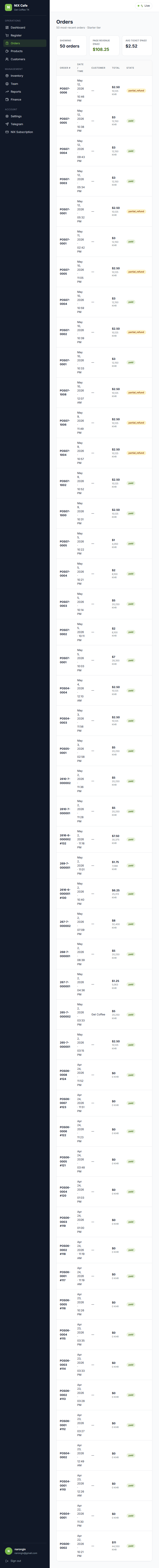
app/(authed)/orders/starter-orders-client.tsx
Header stacks on phone; KPI strip 1 / sm:3
Same table-vs-cards split with Print + Refund buttons preserved per row
app/(authed)/customers/page.tsx
Both Starter aggregate AND Pro mirror paths get the same treatment:
header stacks, table → cards on phone
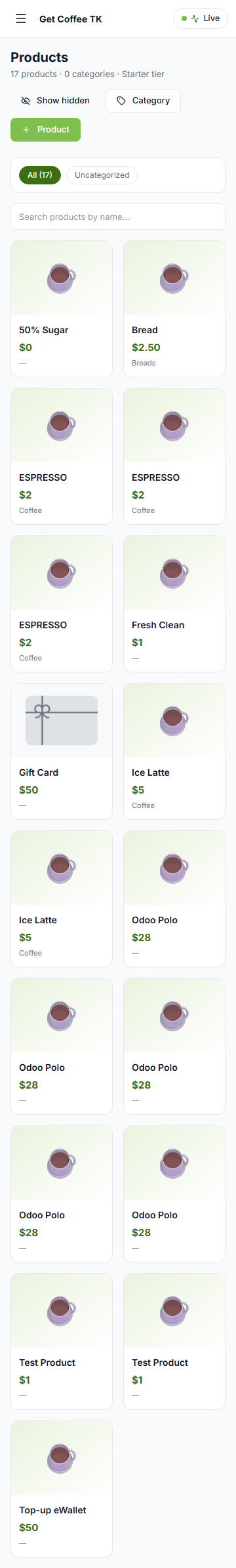
app/(authed)/products/starter-products-client.tsx
Header stacks, action button labels abbreviate on phone (New product →
"Product"). Existing 2/md:3/lg:4/xl:5 grid already responsive.
app/(authed)/reports/page.tsx + reports/daily/starter-daily-client.tsx
Header date-nav buttons flex-wrap on phone; KPI/chart grids responsive
app/(authed)/team/team-client.tsx
Tabs scroll horizontally below md; member rows convert to cards with
Edit button preserved
app/(authed)/settings/layout.tsx
grid-cols-1 md:grid-cols-[220px_1fr]
app/(authed)/settings/_components/settings-nav.tsx
Mobile on /settings index: full nav renders below the title
Mobile on /settings/X sub-route: nav collapses to "← All settings"
back link (avoids scrolling past 13 nav items every time)
None blocking. A few small things worth doing in a later iteration:

- Modals (Invite member, Edit member, customer picker etc.) reduce p-8
  → p-5 sm:p-8 on phone to free ~32px of width.
- The Inventory + Finance pages are placeholder routes today; add to the
  responsive sweep when they're built.
- Telegram + Subscription billing rows could fit one more piece of info
  per row on phone (we currently truncate aggressively).
- Cafe POS register (lockable shell) was intentionally skipped — if
  cashiers ever start using phones at the counter, that's a separate
  scope decision because the register UX is multi-panel (product grid +
  cart + payment + receipt) and doesn't fit a phone without a different
  layout pattern entirely.