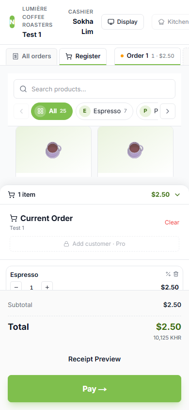
1 — Phone: menu scrolls on top, cart pinned at the bottom, Pay on-screen
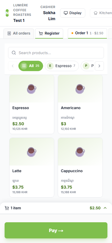
2 — Cart collapsed → menu grows ~4× (104px → 426px), Pay still visible
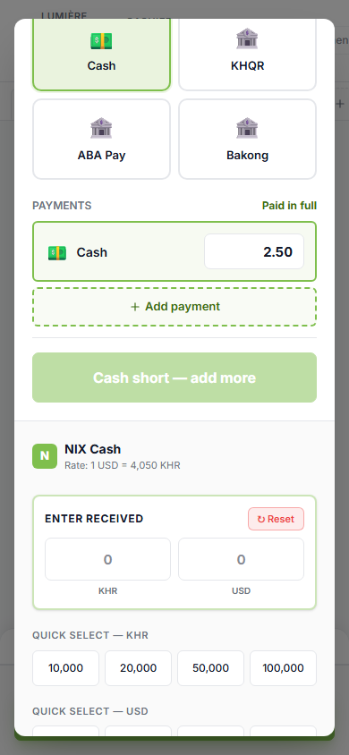
3 — Pay dialog: single column, scrolls, Confirm reachable
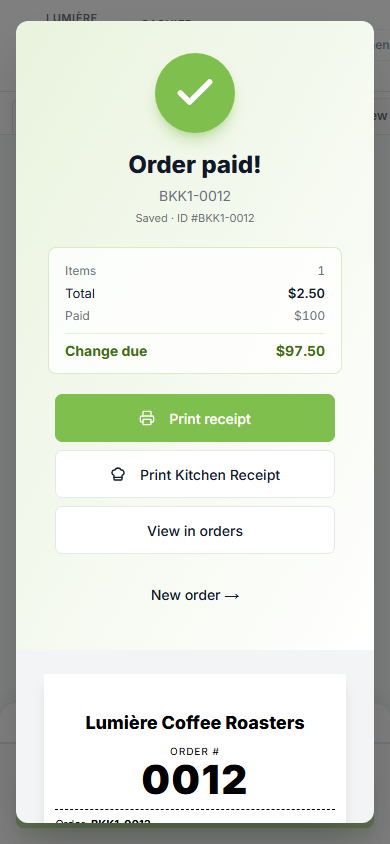
4 — Success modal: stacks to one column, receipt actions reachable
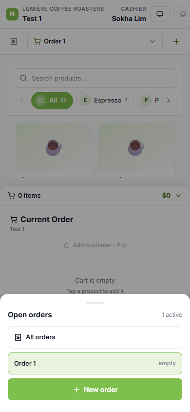
5 — Order switcher: a slide-up sheet (replaces the desktop tab strip on phones)

6 — Orders history: stacks to one column (was a 600px master-detail)
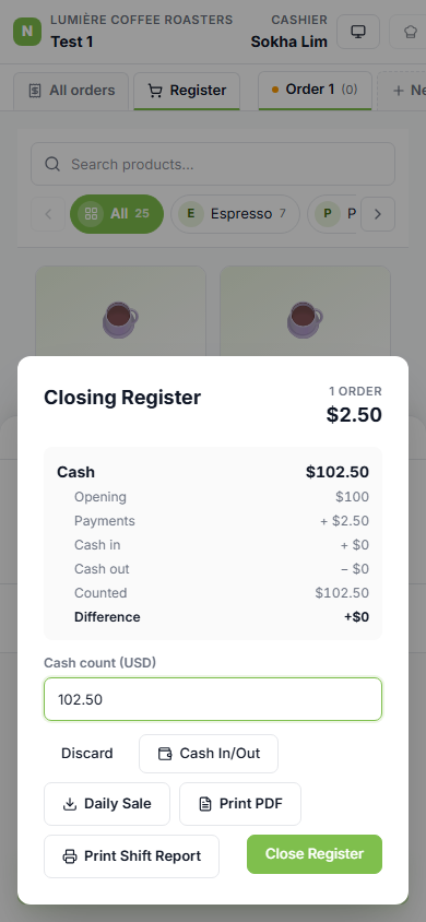
7 — Close-shift dialog: fits the screen, Confirm reachable
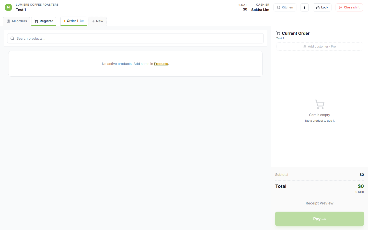
8 — Desktop unchanged: cart stays the right-hand column, full height